Data Visualization for the USAF
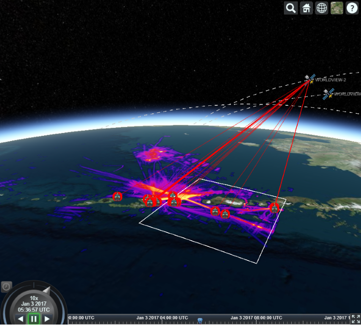
In two weeks, KeyLogic created an interactive Big Data dashboard for the USAF that displays when satellites can see ships at sea. The exercise was to take raw satellite and vessel location data and discover when each satellite could see each ship (“hits”). As part of this exercise, we were also asked to find any “holes” in […]
Data Visualization for the USAF Read More »

