Data Visualization
KeyLogic delivers static and interactive visualizations of structured and unstructured data in a wide variety of formats tailored to the mission needs of the customer.
A Picture Is Worth a Thousand Spreadsheets
KeyLogic’s data scientists, analysts, web designers, and UX / UI experience experts work with customers to design and implement visualizations that support decision making and operational performance.
Making Sense of Data
From flashing alerts on control panels requiring immediate user attention to deep immersive virtual reality (VR) dives into subsurface geologic formations, KeyLogic designs visualizations that help customers quickly assess important information and make sense of complex data.
Format Optimized for Mission Objectives
KeyLogic knows that a successful visualization starts with an understanding of the mission need and the conditions of operational use. Simple visualizations can be pushed to mobile devices at the edge or summarized in a dashboard, while large, complex visualizations may require an interactive touch wall or a VR system. Whatever your need, we can customize a visualization solution that matches the data format and presentation platform to mission and operational needs.
Autogenerated Reports and Interfaces
Drawing on the latest developments in literate computing and natural language processing (NLP), KeyLogic strives to automate not just analytic processes, but also the automatic generation of high-quality published reports that combine graphics and text.
Related Insights
Data Visualization for the USAF
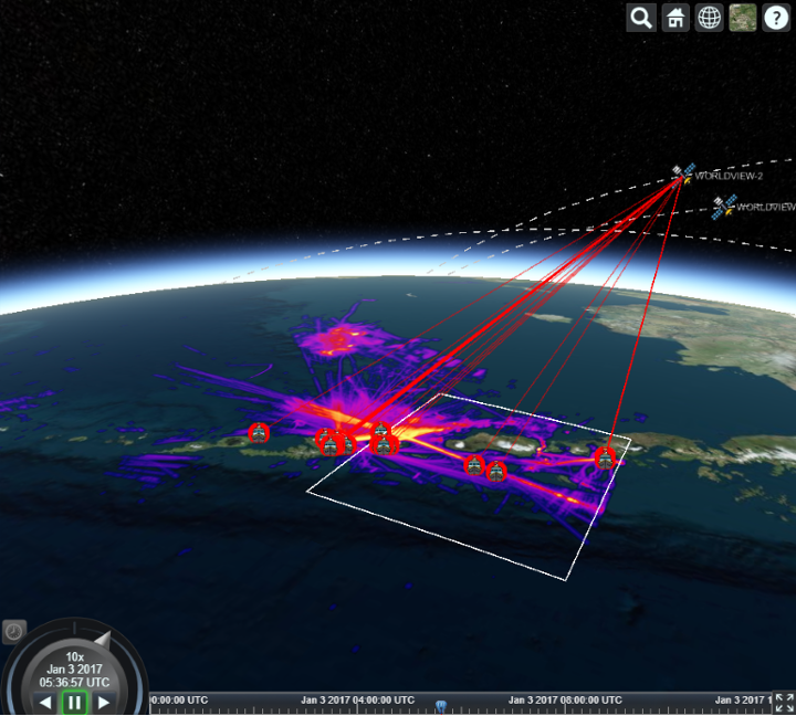
In two weeks, KeyLogic created an interactive Big Data dashboard for the USAF that displays when satellites can see ships at sea. The exercise was to take …
Let's Chat
Data Visualization Experts
Learn more about how KeyLogic can develop a customized visualization for your specific needs.
